 award of merit

cmacdonald@hlkagency.com
When two brands sell nearly identical products, design can’t just be beautiful. It has to do the impossible: create distinction where none exists.
That was the craft challenge behind reintroducing StarMark® and Fieldstone® — two legacy cabinetry brands with shared product lines, shared craftsmanship, and decades of equity, but a need to show up as distinct, premium choices for different audiences.
There was no product story to separate them, only design.
In a category defined by excess — endless finishes, styles, and visual noise — we made a deliberate choice: subtraction over addition. Not to make the brands look minimal, but to make every decision carry more meaning. Because when you have fewer elements, craft is exposed. Every detail has to be exact.
We’ve redrawn the logos with precise proportions, using small, almost imperceptible refinements that shift how each mark feels over time. Typography isn’t decorative. It’s structural: a carefully tuned system using spacing, weight, and rhythm to create hierarchy without relying on excess.
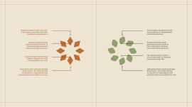
Iconography has been reduced to its most essential forms, designed to support — not compete with — the product. Every line has been considered for consistency, clarity, and scalability across applications.
But the real craft challenge wasn’t creating a system. It was creating two.
A unified foundation ensures consistency — grid, motion principles, typographic logic — while each brand expresses itself through calibrated differences in tone, pacing, and composition. One system, flexed with precision, creates distinction without fragmentation.
Photography leans into material truth. Light isn’t added for drama, but is controlled to reveal texture, grain, and finish exactly as they are experienced in real spaces. Every shot is composed to feel effortless, but nothing is accidental.
Motion extended that thinking. Transitions are subtle, almost imperceptible — designed to mirror how the eye moves across a surface, which is not how ads typically demand attention. The effect isn’t “spectacle”. It’s “immersion”.
Even the films resist convention. No overbuilt narratives. No forced messaging. Just a disciplined focus on craft itself — hands, materials, process — edited with restraint to let the work speak.
The result is a system where precision does the heavy lifting. One that scales seamlessly across video, digital, print, and environment, all while maintaining integrity at every touchpoint.
Most importantly, it solves the core challenge. Two brands. Same products. Now, they are unmistakably different. Not because of what we said. Because of how carefully we’ve designed every detail to say it.