silver
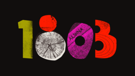
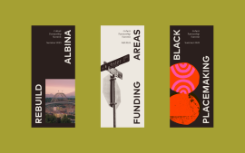
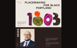
The 1803 Fund brand identity embodies the meeting of raw and refined. Expressive logo numerals, vibrant patterns, and textured collages evoke community, mobilization, and growth. Rooted in Black culture and Portland’s unique character, the system reflects 1803 Fund’s dual spirit: grassroots energy and a highly sophisticated set of strategies and tactics that aim for economic development and community strength.
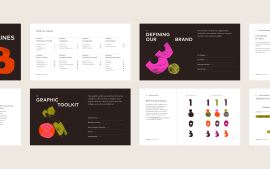
1803 Fund needed a brand that honors Portland’s Black heritage while feeling contemporary, energetic, and polished. The challenge was balancing authenticity with institutional credibility. The goal was create a system flexible enough to span events, philanthropy, investing, community work, and storytelling. We wanted to make sure that the organization could grow with this system and be able to show up in myriad ways.
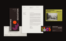
We built a dynamic system blending textured numeral logos, collage-driven graphics, and vibrant yet grounded colors. This allowed 1803 Fund to authentically represent its mission across diverse platforms. We actually built two key elements: the straightforward 1803 Fund with the slash in a serif font, and the more graphical elements. 1803 Fund received immediate community recognition, strong partner engagement, and a successful launch.
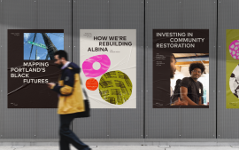
Albina, Portland’s historically Black neighborhood, is central to the brand story. Textures were sourced from local landmarks, such as Dawson Park and Albina Avenue. Visual references to Black artistry, migration, and growth help connect the brand to regional history and culture in a vivid, living way.
No.