silver
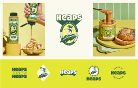
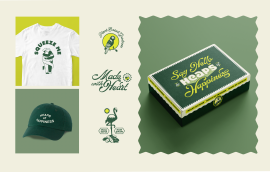
Heaps set out to deliver plant-based joy, so we built a brand that radiates happiness. From strategic positioning to playful packaging, every element was designed to disrupt the category with delight. “Heaps of Happiness” became both their tagline and brand platform, resulting in a craveable brand world with broad appeal and standout shelf presence.
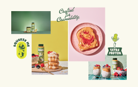
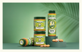
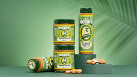
The peanut butter category is crowded with bland and functional brands. Heaps set out to create a premium and joyful alternative that put wellness first, focusing on high protein and vegan values. The goal was to disrupt the category with the launch of two products, a squeezable and a spreadable peanut butter, brought to life through a modern, design-forward brand.
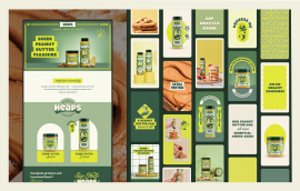
We created a flexible identity system anchored in “Heaps of Happiness,” designed to delight and remain recognizable across platforms. The brand language included playful icons like kale leaves and sunbursts, clever copywriting, and a neon yellow that added a modern, digital edge. As a scrappy new brand, Heaps launched with a unified look across web, social, and PR. Early buzz from influencer kits sparked strong initial interest and engagement.
Heaps is based in Miami, which shaped its sun-soaked, feel-good energy. The brand draws lightly from surf culture and retro Americana, while the kale leaf icon reflects the founder’s roots as a vegan chef. These cues help ground the design in both lifestyle and values.
No.