bronze
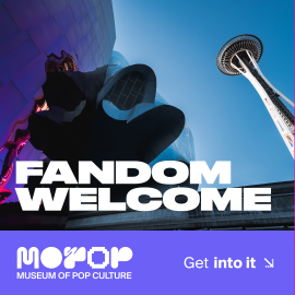
The Museum of Pop Culture (MOPOP) in Seattle is the only museum solely dedicated to the world-shaping, constantly changing power of pop culture. But after a series of name changes and brand evolutions, MOPOP left out-of-towners and Seattleites confused about what exactly goes on inside the iconic guitar-shaped building and why they should visit.
Our task? Help evolve MOPOP’s look and drive more visitors to the museum – but more importantly, make it clear what MOPOP is all about: connecting pop culture to the people who create it.
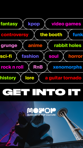
We needed to distill an incredibly multi-faceted institution, offering everything from horror movie exhibits to drag camp into one easily accessible branded campaign.
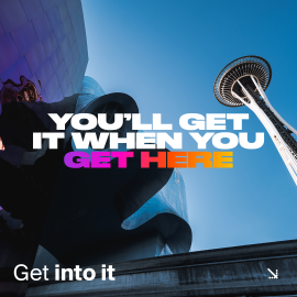
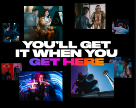
Working from media insights about MOPOP’s audience, we concepted with a segmented strategy – telling the brand story in digestible pieces most compelling to each major audience: for in-market (locals) messaging, a focus on the emotional and community value of a relationship with MOPOP; and for out-of-market, a focus on the unique experiences (and selfie opportunities) MOPOP provides.
With an eye to longevity, we began a library of design elements – like arrows, pills, and a custom gradient – to connect the concept across placements, audiences, and messages.
Overall, creative was structured to target specific audiences and learn from testing. In-market messaging spoke to the emotional value of repeated visits, with more polished photography. Out-of-market messages highlighted the genres and artifacts tourists would find interesting, and focused on UGC. Additional testing included animated vs. static placements, and seasonal vs. evergreen messaging.
No
No