bronze
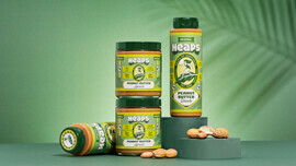
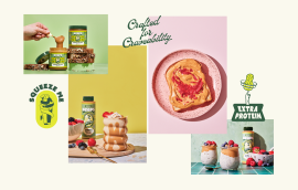
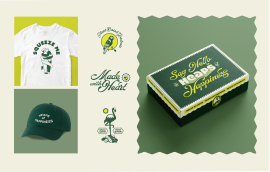
Heaps set out to deliver plant-based joy, so we built a brand that radiates happiness. From strategic positioning to playful packaging, every element was designed to disrupt the category with delight. A squeezable peanut butter format added novelty, while “Heaps of Happiness” became both tagline and design ethos, creating a craveable presence that leaps off shelves.
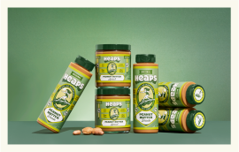
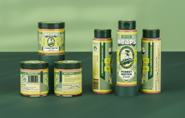
The peanut butter aisle was dominated by bland, functional brands. Heaps wanted to introduce a premium, wellness-forward alternative focused on high protein and vegan ingredients. With a unique squeezable format, the goal was to stand out on shelf and evoke a sunny, healthy lifestyle. The packaging needed to feel joyful and charming, while staying flexible for future product lines.
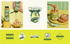
We created a packaging system rooted in illustration and storytelling, inspired by the sun-soaked energy of Miami and the golden era of surf culture. The flexible logo and illustrated icons married vintage charm with a modern aesthetic. The health-forward green paired with neon yellow gave the brand both outdoor appeal and a digital edge. Every detail was crafted to feel intentional and on-theme. The result was a distinctive shelf presence, strong social content, and an identity ready to grow beyond peanut butter.
Heaps is based in Miami, which shaped its sun-soaked, surf-inspired aesthetic. The kale leaf icon nods to the founder’s background as a vegan chef, grounding the design in both lifestyle and values.
No.