bronze

The local Portland chapter of the professional group AIGA (American Institute of Graphic Arts) needed a brand refresh and website to better represent and serve their local creative community. Our diverse team of volunteers came together to strategize, create, and deliver this bold next chapter for our organization.
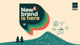
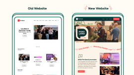
Our team’s main goal was to give our chapter a uniquely Portland feel from its previous brand, and to stand out among the numerous chapter across the country. We also wanted to improve both the user and volunteer experience when navigating the site, and build a great foundation for future volunteers to build upon.
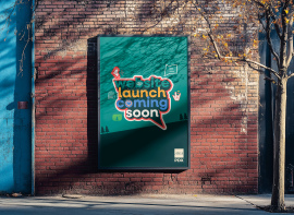
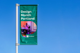
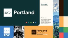
We based any major decisions on data gathered from the old website and surveys from our community. The work is a direct reflection of our research merged with the board's goals for the chapter moving forward. The brand aesthetic evolved to combine local natural colors paired with bold pops inspired by our city, such as Rose red and Fern green. Playful illustrations were also integrated, including a new large “P” framed for graphics, photos, and more. For the website, we condensed and streamlined content to speak clearly to the Portland creative community.
The chapter’s new brand refresh strongly anchors ourselves in our local community in Portand and the greater Oregon populace. Brand photos, colors, illustrations, and graphics all looked to our surroundings for inspiration. We wanted to showcase our community, stand-out from other AIGA chapters across the country, and provide a welcoming space for all creatives.
No