merit
merit

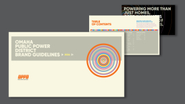
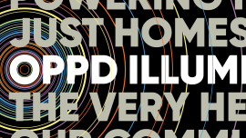
The goal of the OPPD brand guidelines was to convey the diverse ways it delivers energy and the positive impact it has on the communities it serves. At the core of the identity is a spectrum of colors and concentric circles, symbolizing the ripples of good energy that bring this concept to life.
We intentionally avoided the overused power company clichés of technical typefaces and lightning bolts, opting instead for the friendly yet bold Gilroy font and forward-pointing arrows.
However, the new brand cannot be all friendliness. As a power company, OPPD is an essential service and, in many cases, the only reliable source of information when power outages occur. Therefore, these guidelines establish a clear distinction in visual and copy tone: brand communications are approachable and neighborly, while essential communications prioritize clarity above all else.
Last year, OPPD, a public power company, launched a progressive vision for the future. However, its brand did not align with that vision.
Okaybro conducted an in-depth exploration to develop a new brand strategy that brings this vision to life for both employees and customers alike.
The goal is to inspire employees to embrace the new vision and communicate more consistently, while also fostering greater engagement from customers.
The guidelines launched only a few ago, but adoption from employees so far has been strong.
Yes. We used AI to create examples for the photography guidelines. They will be swapped out as new photography is shot.