merit
merit
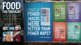
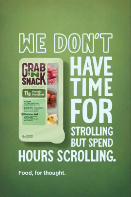
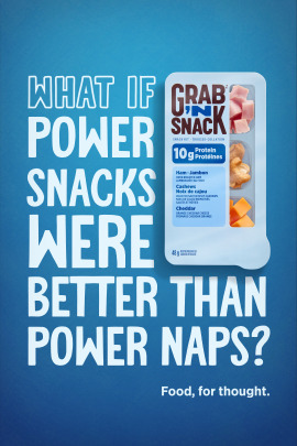
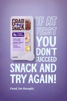
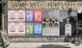
Grab ‘N Snack, Maple Leaf Foods’ on-the-go protein pick-me-up, had recently undergone a package design refresh. One that made the product/design feel more organic, natural, and zen-like. The brand was repositioning itself to a new target; young professionals and students, versus moms and tweens. This meant speaking to this new target about what mattered most to them: getting things done and having the energy and focus to do so.
With the newly designed packaging and the $80K production budget in mind, we developed a headline-driven campaign with zen-like, thought-provoking questions about the way our target snacked and fueled up; we gave them some ‘Food, for thought’. The campaign got our target to rethink their routines and how they typically satisfied their daily protein needs. This headline, type-driven approach allowed us to maximize the smaller production budget without minimizing break-through. The campaign was template-able, flexible, and easily adaptable across all media channels.
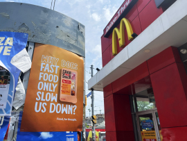
Smaller production budgets are just kind of the norm these days. So, we’re used to creatively making those budgets work - and work hard. So, when it came to launching Maple Leaf Foods’ newly redesigned Grab ’N Snack brand, with just $80K for production, we got creative.
The head-turning headlines leaned into the new package design with modular type to give it an unmistakable look, full of new Grab ‘N Snack personality and style. The creative also integrated the new package design within the headline treatment, allowing our target to easily recognize the product on shelf. At the heart of the campaign were a series of bright and bold, eye-catching wildpostings, supported by executions across social, OLV, Reddit, and even contextual guerrilla placements.
Marking Awards - in the OOH, Poster category