merit
merit

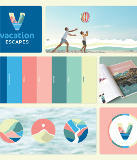
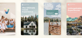
Capital Vacations needed to rebrand its rental business, formerly known as Destinality, which lacked clarity and failed to engage consumers. The goal was to develop a brand that was more inviting, family-friendly and memorable. Through extensive keyword research and consumer testing, we landed on the name **Vacation Escapes**, a clear and intuitive choice that resonated with our core audience. Customer data revealed that our target consumer prioritizes family travel, particularly beach and resort vacations, so the brand identity needed to reflect excitement, adventure, and unforgettable experiences.
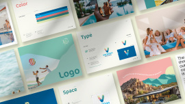
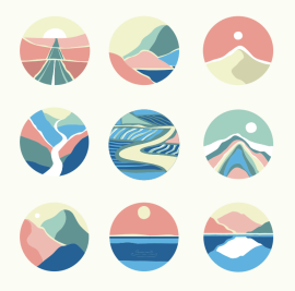
The strategy behind Vacation Escapes was rooted in creating a brand that was both descriptive and emotionally compelling. The name itself is easy to discover and remember, while the visual identity was designed to evoke joy and warmth. Versatility was a key consideration, ensuring the brand could be adapted across multiple locations and property types. A distinctive design approach was taken, incorporating bold colors, approachable typography, and inviting iconography to stand out in a competitive landscape.
To bring the brand to life, we tested four logo directions, ultimately selecting the one that was both the most appealing (43%) and the most memorable (59%). The final mark perfectly captures the thrill of planning and experiencing the perfect escape. Beyond the logo, we developed a complete visual identity system, including brand colors, typography, iconography, and layout structures, ensuring consistency while allowing for flexibility. A comprehensive digital brand book serves as a living resource, designed to evolve as the brand grows, providing a strong foundation for future marketing and expansion.
N/A
N/A
PRINT Magazine Awards 2025
Charleston ADDY Awards (AAF) 2025