The Spokane Colleges rebrand unified two community colleges—Spokane Community College and Spokane Falls Community College—under a singular, cohesive brand identity to clarify their value and drive enrollment. The brand strategy repositioned Spokane Colleges not as a second-choice alternative to universities but as a strategic, practical, and empowering choice for students. The rebrand introduced a unified logo, an elevated Sasquatch mascot as a symbol of resilience, and the "Get There" campaign, which positioned Spokane Colleges as the fastest route to achieving career and education goals.
Challenge:
Community Colleges of Spokane faced an enrollment crisis, with numbers dropping over 20% in three years, exacerbated by COVID-19. Despite offering an affordable and practical education, the colleges struggled with brand fragmentation, leading to confusion among potential students.
Objective:
Drake Cooper was tasked with creating a clear, unified brand for Spokane Colleges that would:
Strengthen its market position
Differentiate it from four-year universities
Increase enrollment by making its value easily understood
Overcome stigma around community colleges by celebrating their unique advantages
Solution:
Brand Unification: Introduced "Spokane Colleges" as an overarching brand to consolidate Spokane Community College (SCC) and Spokane Falls Community College (SFCC).
Brand Positioning: Shifted the narrative from competing with universities to embracing its role as an accessible, adaptable pathway for students.
Logo & Identity: Created a visual identity representing Spokane's landscape, merging the colleges’ symbols (a tree and waterfall) into a compass needle, symbolizing student direction and progress.
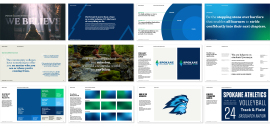
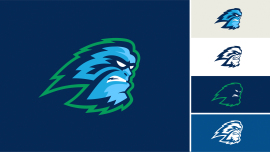
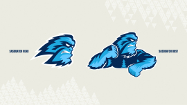
Mascot Evolution: Transformed the Sasquatch mascot into an inspiring, untapped-potential symbol, reinforcing resilience and independence with the rallying cry, "We believe!"
Launch Campaign: The "Get There" campaign delivered a compelling message: Spokane Colleges isn’t a fallback—it's the fastest way to success.
Results:
The rebrand provided clarity and cohesion, making Spokane Colleges more recognizable.
It reframed community college as a proactive choice, challenging misconceptions.
The campaign resonated with students looking for a practical, results-driven education.
Yes. Spokane Colleges' identity is deeply tied to its regional landscape and culture:
Visual Identity: The logo design incorporates a tree and waterfall, elements reflective of Spokane’s natural surroundings, reinforcing local authenticity.
Mascot Revamp: The Sasquatch—an iconic Northwest figure—was reimagined as a symbol of perseverance, potential, and the spirit of the region. Spokane Colleges is the only college in the U.S. to have Sasquatch as a mascot, making it a unique differentiator in higher education branding.
Campaign Language: "We believe!" ties into both Sasquatch folklore and the determination of students forging their own paths.
 39
39