36
36

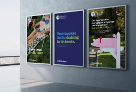
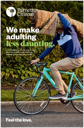
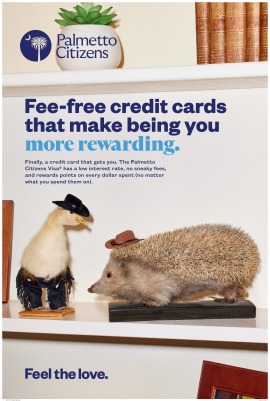
Palmetto Citizens has been a trusted financial institution in the South Carolina Midlands for nearly 87 years and they are growing. As part of their expansion plan, Palmetto Citizens hired Walrus for a brand renewal complete with a fully realized brand platform, positioning, visual identity update, photo library, collateral, and website. Palmetto Citizens is truly a part of the community and they go the extra mile for their members no matter how many commas they have in their accounts. They are not just about money, they are committed to making the Midlands a better place by putting the people and the community first. When you do whatever it takes to help members realize their dreams it starts to look a lot less transactional and a lot more like love. Palmetto Citizens Feel the Love tagline is the foundation of this campaign.
Palmetto needed an identity refresh. They hadn’t revised graphic assets for some time and the existing identity felt a bit old fashioned. We needed to provide Palmetto Citizens FCU with a fully realized brand platform consisting of a new brand positioning, visual identity, and a new website. The ID needed to convey both the history of the bank and the solidity of it as an “institution” as well as point at its dynamic future and expansion in the region.
We introduced an evolved Palmetto Citizens mark, a brand new and elegant Logotype, and a completely modernized ID system. A critical development was a revamped “Palmetto Citizens Blue” - we brightened it, and the new PCFCU Blue became a primary visual component of the new identity. The ID/logo/mark and design system reflects the new brand strategy and brand platform, “Feel the Love” by contemporary use of color, typography and photography but it remains accessible and friendly through use of language and fun and playful imagery.
The South Carolina State shape with the iconography of the South Carolina state flag were regional components of the existing Palmetto Citizens logo. The Palm and the Moon were required iconography for this identity. It needed to stay rooted in recognizable and trusted symbolism.
No