28
28

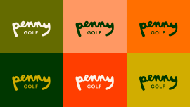
Penny Golf, a startup women's golfwear brand (Instagram: @pennygolf), celebrates the joy of playing golf for the love of it with a hand-drawn logo inspired by organic shapes found on the course, like sand traps, water hazards, and fairways. The bright red-orange poppy symbolizes the founders' English and Californian heritage.
In a brand category like golf, dominated by performance, technique and measurement, how do you create space for a brand that’s based on being joyfully imperfect and go with the flow? That was the challenge from our friends at Penny Golf. As a startup women's golf wear brand, Penny Golf celebrates the love of the game with a hand-drawn logo inspired by the organic shapes of the course—sand traps, water hazards, and fairways.
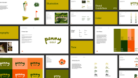
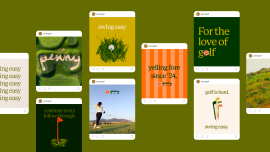
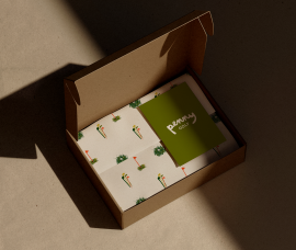
The loose line quality and lowercase letterforms of the logo are approachable and relaxed, especially in the context of the pro shop, dominated by serious, technical brands and jargon. The bright red-orange poppy nods to the founders' English and Californian heritage. In addition to the logo system, we developed a color palette, typography system, brand guidelines, photography style, tone of voice, packaging, and a signature illustration style that is loose and sketchy. Our research involved feedback from the target audience and branding experts outside the agency, with success gauged through their direct insights.
N/A
N/A
GSFAC ADDY Awards (AAF) 2025