 merit
merit

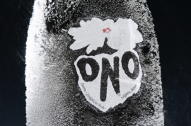
Crafted at the 8th oldest brewery in Japan, yet versatile enough to enjoy beyond traditional settings, we partnered with Sake Ono to honor this centuries-old spirit with a contemporary take on the category. We created an identity, packaging, and art direction that stands up to this new approach.
We wanted the visuals for Sake Ono to capture its purity and Japan’s rich heritage of sake—but to avoid pastiche interpretations that felt well worn and uninspired.
Originally looking into various ways of making throughout Japanese art history as our starting point for design. Drawing inspiration from kintsugi, paper triptychs, and the geometry of zen gardens to sketch early iterations of the Sake Ono label.
We then decided on floral woodblock prints as a starting point for the final design, and research on how we could use symbolism and color to cue these ideas of purity and celebration.
The Sake Ono color palette is bold and minimal, reminiscent of the graphic nature of Japan’s flag. The palette includes a soft black and a warm white as its core colors. This grouping establishes a soft, achromatic base with a vibrant TOYO Red as its accent color.
The positive reception of this project in the world of graphic design has been a delight to witness and be part of, where we hope this gorgeous work speaks for itself in the world of packaging design, graphic design & the crowded spirits market.