 38
38

Google’s app, Project Relate utilizes machine learning to help individuals with non-standard speech communicate. In creating the app's online home, we interviewed dozens of Project Relate users and highlighted their stories throughout the site. Keeping accessibility in mind throughout the site build, we optimized for performance, screen readers, color contrast and Lighthouse scores. In the end, we amplified the product benefits with animations and user stories to draw our audience in.
For the app’s beta launch, we were tapped to create a product-driven website with a goal of driving awareness and usage amongst the estimated 250 million people around the world with non-standard speech patterns.
From the beginning, we knew that this site had to have a higher degree of accessibility than standard sites. Part of that involved making sure that the site was easy to navigate, especially for our core audience: speech pathologists, medical experts and family members.
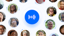
The first time we heard one of Project Relate’s users communicate, we knew the direction we wanted to take the site. Through WebGL, Lottie animations, screen reader optimizations and other web based technologies, we were able to put these users’ stories front and center and shine a light on the community in their own words.
In addition to visualizing the scale and scope of non-standard speech, we amplified the product’s benefits with animations that illustrated how the machine learning technology works. This allowed users to take away a deeper understanding of the app’s benefits with bite size chunks of information as they scrolled.
Featuring stories from real users as our foundation, we were able to create a dynamic and inclusive web experience with empathy and understanding at its core. Even with a tiny media budget, the product launch was enthusiastically celebrated by the community, earning mentions in Forbes, CNET, and various other blogs. Since the website launched, there has been a massive jump in beta applications, and general awareness has never been higher.
That’s due in part to accessibility—the site hit our Lighthouse goal of 100/100 in Accessibility.