bronze
Retail Voodoo
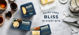
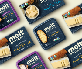
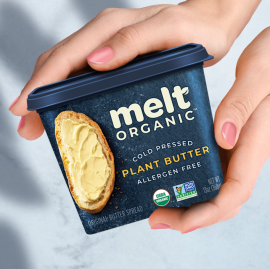
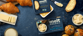
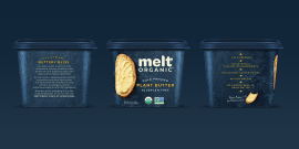
This is a packaging system for an Organic Plant-based butter brand that is meant to disrupt in a crowded category, communicate its unique point of difference (that is the only Organic brand in the category, others have organic lines but are not an organic only brand), deliver on taste, and communicate the idea of "culinary bliss"!
Melt Organic butter was being discontinued by key retailers due to a lack of meeting velocity hurdles, distinction at shelf and confusion within the category. Minimal SKUs and facings only compounded their challenges at retail. Melt's key objectives were to create a brand design that stands out in a crowded category, that looks culinary and delicious, and that reassures consumers that it is better for them and better for the environment.
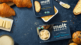
We paired a deep rich blue palette, to give Melt Organic culinary feel while standing out in the category, with a creamy pale yellow that has a distinctly buttery personality. Taste is important so we featured Melt Organic’s products in use on their tubs, rather than in isolation, to lend a sense of delicious appetite appeal that suggests just how creamy and delicious their products are. Sticks are mainly used for baking, so we made their products on sticks packs, the hero of a baking story, to reassure skeptical consumers that Melt Organic Plant Based butter performs just like its dairy counterparts.
The results: Regaining space with lapsed retailers, attracting new consmers, and ever-increasing sales.
No