 bronze
Big-Giant
Identity for a fintech start up within the banking technology support space looking to simplify and disrupt authentication with higher levels of
The creative juxtaposes strength and trust needed within financial tech against the ease and approachability of the frictionless technology.
The objective was to develop an identity that matched the simplicity of the product's functionality and overt naming, while developing a mark that provides enough of a presence to build long-term equity and meaning in the identity.
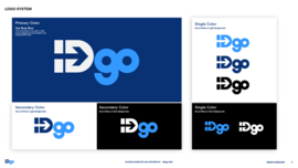
The mark provides a clear sense of strength and protection in it’s bold all cap "ID"—the element users of the banking institutions clients implementing the technology.
The lower case simplified "go" matches the ease of the institution and end users product experience.
Results:
_The mark's comfortable boldness allows for small scale usage and lower resolution applications often needed within digital applications.
_The system allows for further simplification with the independent use of ID while maintaining clear connectivity to the overall identity system.
_The tonal pallet provides a sense of transitional ease and implies the transparent overlay of the products bolt on function.
N/A
N/A
No
